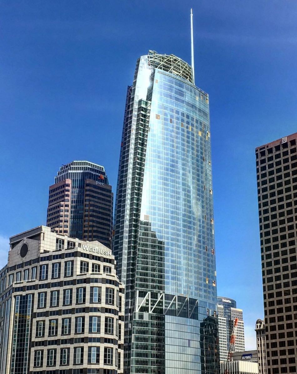
The Wilshire Grand, a new feat of engineering in Los Angeles, features a 178-foot mast and a ‘sail’ to go with it. This would be fine — impressive, even — if the Wilshire Grand was a schooner, sloop, or clipper ready to push off from San Pedro and ply the high seas. But the Wilshire Grand is very much landlocked, 15 miles from the nearest ocean, anchored to bedrock by 73 floors. It’s a skyscraper. Shiny and new, and, for the moment, “officially” the tallest west of the Mississippi.
The Wilshire Grand received its share of fanfare at its grand opening on Friday, as well it should. It’s a major addition to downtown Los Angeles’ stock. Architecturally, it’s handsome enough and it is a landmark by any measure. In a city that remains famously horizontal, it’s fun to get excited about something vertical.
But let’s get real: the Wilshire Grand does not deserve to be called the tallest building in Los Angeles.
For people who can’t count, measure, and compare on their own, there’s something called the Council on Tall Buildings and Urban Habitat, which “officially” measures and ranks skyscrapers. Says its website self-referentially, "The CTBUH also developed the international standards for measuring tall building height and is recognized as the arbiter for bestowing such designations as 'The World’s Tallest Building.’ Who these people are and, more importantly, why they get to define “tallest” is beyond me.

Interestingly, and most importantly for this discussion, CTBUH includes masts, spires, and other semi-decorative elements in its calculation of a building’s height. That’s why, for instance, the Petronas Towers (88 floors) overtook the Sears Tower (108). And it’s why One World Trade Center, at a relatively puny 94 stories, even breaks into the top 10. Its spire brings it up to 1776 feet. That patriotically symbolic number that surpasses the Guangzhou CTF Finance Center and willfully disrsegards the way architects measure buildings -- in meters. (The New York Times helpfully noted some while back that WTC's 541 meters commemorates the year Totila became king of the Ostrogoths.)
I’m not an engineer or an architect, but I know the difference between a spire and a story. Any layperson can appreciate that the true height of a building depends on its highest operable floor. If I’m feeling charitable, I’d throw in service floors or accessible rooftop. What I’m not willing to concede is that the 73-story Wilshire Grand, whose roof tops out at 934 feet, is "taller" than the 73-story, 1,018-foot US Bank Building — which has a flat roof and no protuberance to distort its height.
(However, it has the county's highest open-air bar, which is a record I can get behind.)
Whereas the Wilshire Grand merely makes a mockery of CTBUH standards, the Salesforce Tower, at 61 stories and 1,070 feet, is already ruining San Francisco. While it doesn’t resort to gimmicks to proclaim its height, its massive dome looms distractingly over what is — as skylines go — one of the most beautiful in the world. Granted, the Transamerica Building and its spire were always destined to be surpassed, the Salesforce Tower, looking for all the world like an aluminum-clad baguette, suggests that maybe there’s some wisdom to San Francisco’s infamous, and mildly ridiculous, shadow ordinance.
But, honestly, who cares?
While architecture buffs, like myself, can argue how many angels can dance on the head of a spire, we really have to ask whether our cities are better off for these mega-structures.
As I wrote recently in Common Edge Collaborative, gleaming skylines often belie banal or even inhumane conditions at street level. So many skylines, be they as impressive as Dubai or as banal as Fresno, come down to earth in entirely unimpressive ways. They rise above empty sidewalks, expansive parking lots, overly wide boulevards, and nothing resembling local culture or style. Places like New York, Hong Kong, and San Francisco are the exceptions. Downtown Los Angeles…. it falls somewhere in between.
Buildings like the Wilshire Grand and Salesforce Tower superficially proclaim their cities’ ambitions and testify to their healthy economies. They do one thing planners like, which is to reinforce the primacy of downtowns and take advantage of transit networks. Salesforce sits atop the new Transbay Terminal, and Wilshire Grand is across the street from Los Angeles’ second most important transit stop. And yet, they are lacking.
Plenty of urbanists, including Jean Gehl James Kunstler have decried highrises. Leon Krier famously considers them "vertical cul-de-sacs," entrapping their occupants in a dead-end structure and sapping life from their surroundings. And, like cul-du-sacs and their suburban neighborhoods, high-rises are, in many ways, cakewalks for planners. It’s easier to approve one big thing than it is to tend to the countless complex minutiae that make streets, cities, and neighborhoods truly great. And yet, that’s where real planning heroism lies. God is in the details, not in the clouds.
I’d love for cities — not just Los Angeles, which really isn’t half-bad, but also the Dubais, Shanghais, Shenzhens, and other global cities that are really fixated on height — to pay more attention to their streetscapes and neighborhoods than to their skylines and create places that truly serve and ennoble their residents. Many of the best places are diminutive and detailed, not tall and sleek, no matter what the CTBUH says.
It’s all well and good for Los Angeles to ride the winds of euphoria. But if planners in L.A., and other cities, don’t turn their attention closer to sea level, we’re all going to be sunk.
Photo credit: Fredchang931124 via Wikimedia Commons.