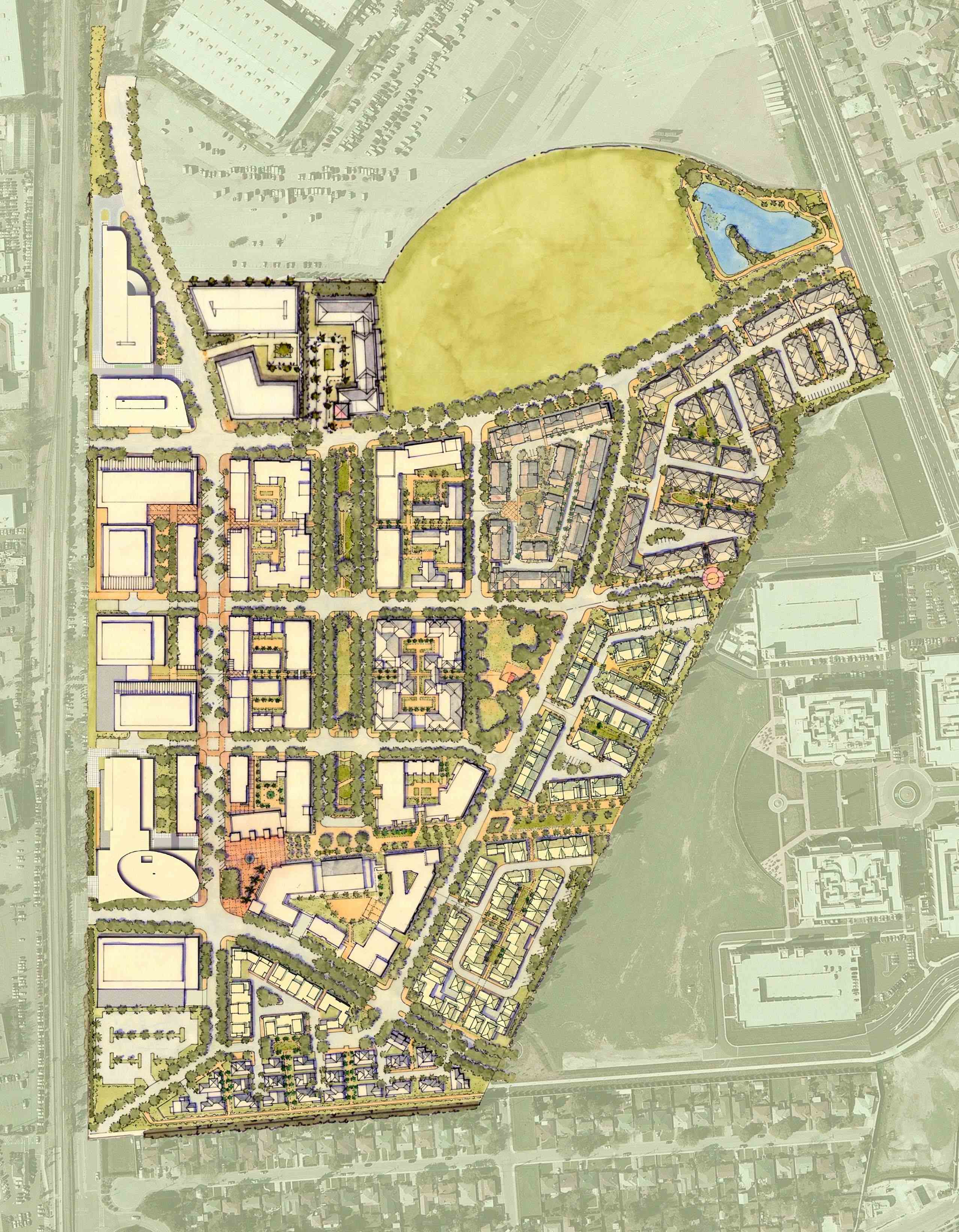
Loath as I am to make grand pronouncements, I think Bay Meadows, the 83-acre project in San Mateo, is possibly the best plan I've seen for a transit oriented development.
This mixed-use proposal brings an unaccustomed level of clarity and order to the design of mixed use-neighborhoods near transit stations. Bay Meadows, in fact, makes most other TODs look almost slipshod and disorganized by comparison. The desire to achieve density, rather than instill a sense of order, often prevails at TODs. The much praised Contra Costa Centre, for example, appears casually planned and suburban compared to Bay Meadows, while others look like dense business parks. But is high-density urban design really incompatible with pedestrian activity?
Bay Meadows' site plan, however, is as easy to understand as a diagram. Yet, the irregular and flexible parts of the plan may be equally responsible for its success.
Planned for the former site of the Bay Meadows horse racing track just south of the San Mateo County fairgrounds, Bay Meadows is entitled to build up to 1.25 million square feet of office space, 90,000 square feet of retail space and 1,170 apartments and condos. (The same developer, Wilson Meany Sullivan, was earlier responsible for conversion of the Ferry Building in San Francisco into office space and retail.)
As in most other TODs, the biggest buildings are closest to the transit station, in this case a future Caltrain stop (which will replace the current Hillsdale station). Also familiar is the strategy of scaling down development the further one gets from the station. Rather than invention, it's the straightforwardness of the design, prepared by Cooper Robertson of New York, is what makes Bay Meadows a model for other TODs. If I were an academic, I might say that Bay Meadows has lifted the klutzy phenomenon of transit-oriented development to a recognizable building type. (Architects, who seem to love opacity in language, might call it a "typology.")
Let's start with the obvious features of the design. Rather than blurring the difference between residential, retail and office buildings, the designers here have made each building type as distinct as possible. Each of the building types–office buildings, retail boxes, apartment clusters—has its own identifiable size, shape and location on the map. Here, the notion of mixed use is more horizontal than vertical, with different kinds of buildings sitting side by side, rather than stacking housing atop storefronts atop one another. Equally important, each building type is arranged in long rows that run down the width of the plan, with the regularity of rows of beads in an abacus. Nearest to the station is a set of five office buildings, known collectively as "The Station." This is Bay Meadows' gesture toward the noble if elusive goal of jobs-housing balance.
Immediately east of the big-footed office buildings is a neighborhood-serving shopping street, which appears relatively narrow and pedestrian friendly plan. This is the place for residents to pick up the dry cleaning and a quart of milk, and it provides some eating places for office workers.
Large-scale, multifamily housing starts on the eastern edge of the shopping street. Moving further east, the housing is interrupted by a linear park that parallels the almost rigid arrangement of buildings. The park is formal and French-looking, like a silk tie on a white shirt. The park looks small, active and inviting for dog walking and bicycling. One sign of refinement of the Bay Meadows plan is that the landscaping tends to be active, as is only secondarily used as a buffer or negative space. The major recreational site is a 12-acre park on the north edge of the plan, which looks like a scoop of ice cream atop a piece of apple pie. The park also provides a buffer (see above) to the immense parking lot for the fairgrounds on the immediate north.
Flexibility is important to Bay Meadows. Although the plan is set up on a grid, the pie-shaped site does not allow the designers to use a strict, unvarying grid. Instead, the grid is soft-edged, allowing lot lines tend to stretch, contract and sometimes take on irregular contours. Slight irregularities in the shape of individual blocks grow more pronounced as we head east, toward the shift to the diagonal streets. The flexibility, whether "suburban" or not, also makes it possible for the developer to develop the land efficiently, with a minimum of awkward, triangle-shaped spaces left over in the transition from the square grid to the diagonal street. Also, the soft-edge nature of the plan allows the designers to provide a pleasant concave edge to the southern boundary of the big park, rather than an ugly, arbitrary straight line.
Nothing in life or urban design is perfect. The designers of Bay Meadows cannot entirely avoid the awkwardness of the site, with the parking lot to the north and a large industrial parcel to the east. In this setting, Bay Meadows may look like a stand-alone suburban island of medium-density development amid big empty spaces. The next place to plan is that parking lot, where hopefully some future developer can extend the orderly urban fabric created at Bay Meadows.

Bay Meadows site plan.
An earlier version of this article listed Bay Meadows in Santa Clara County, not San Mateo County. It has been corrected accordingly.
