Several of the smallest pieces in the de Young Museum’s extraordinary retrospective of California artist Ed Ruscha depict abnormally vast western landscapes. Thin strips of prairie stretch just above the bottom edge of the frame. Attenuated horizons separate starry skies from a dark continent. Extreme horizontality makes even Ruscha’s tiniest images appear immense, capturing the grandeur and loneliness of Earth and sky.
Upon this template, telephone poles recede achingly into a blue-black dusk (Let’s Keep in Touch). Two oil derricks stand at attention on opposite sides of a canvas (Well, well). Clusters of tiny lights huddle close under a starry sky (Two Similar Cities). In America’s Future, an empty horizon at dusk extends forever with every hue between yellow and taupe looming above. These are the pieces that gave the exhibit its title: “Ed Ruscha and the Great American West.”

Though Ruscha depicts landscapes, he is not a landscape painter. For him, the western landscape turns into a symbol of itself, representing all the Americanisms – individualism, freedom, expansion, commercialism – that derive from having so much space on our hands. It also gave rise to a particularly type of urbanism, of which Ruscha is a remarkably astute critic.
Even Ruscha’s emptiest landscapes are foils for the peculiar type of city that arose in the West. Raised in Nebraska, he migrated to Los Angeles in the 1960s, to discover the beauties and ironies of this corner of America. He looks with bemusement upon the place to which so many Midwesterners escaped. At age 78, he continues to work there.
Most of all, Ruscha is to painting what the team of Robert Venturi and Denise Scott Brown are to architecture. Both were inspired by roadside landscapes of the West and fascinated by signage. Both balance aesthetic appeal with visual and verbal irony. Not coincidentally, humor for both of them comes in the form of unexpected use of text.
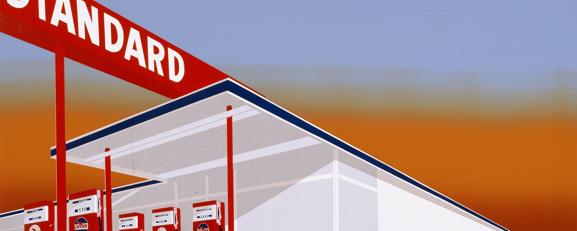
“The Great American West” traces Ruscha’s interest in unexpectedly diverse subject matter while keeping a firm gaze on the ties that bind his works: from monumental paintings of gas stations, to silhouettes of coyotes, to raw words, to photographs of the entire Sunset Strip. The work of humans -- power poles, warehouses, streets, and, of course, written language -- inhabit every Ruscha image. But humanity is deliberately absent. Buildings are rendered deliberately sterile and ironic, curious interlopers on God’s creation. His Standard Oil stations recede so perfectly into the vanishing point, they look more like architectural renderings than they do actual structures. Ruscha’s trademark words are disembodied too, appearing as if stenciled on to the canvas by God, every bit as inscrutable as the landscape itself. This effect reaches its apotheosis in Ruscha's series of the Hollywood Sign, in which words and landscape really do intersect.

Even Ruscha’s photos are vacant. They reveal not architectural beauty but rather its banality. (The de Young, an earnest work of starchitecture by Herzog and de Mueron, is the opposite of all which fascinates Ruscha.) He captures empty of parking lots and backyard pools with undisturbed surfaces. The same goes for his conventional cityscapes and his Sunset Strip photos, which look as evacuated by atomic blast or urgent Sunday sermon.
Ruscha’s West is not a place for people.
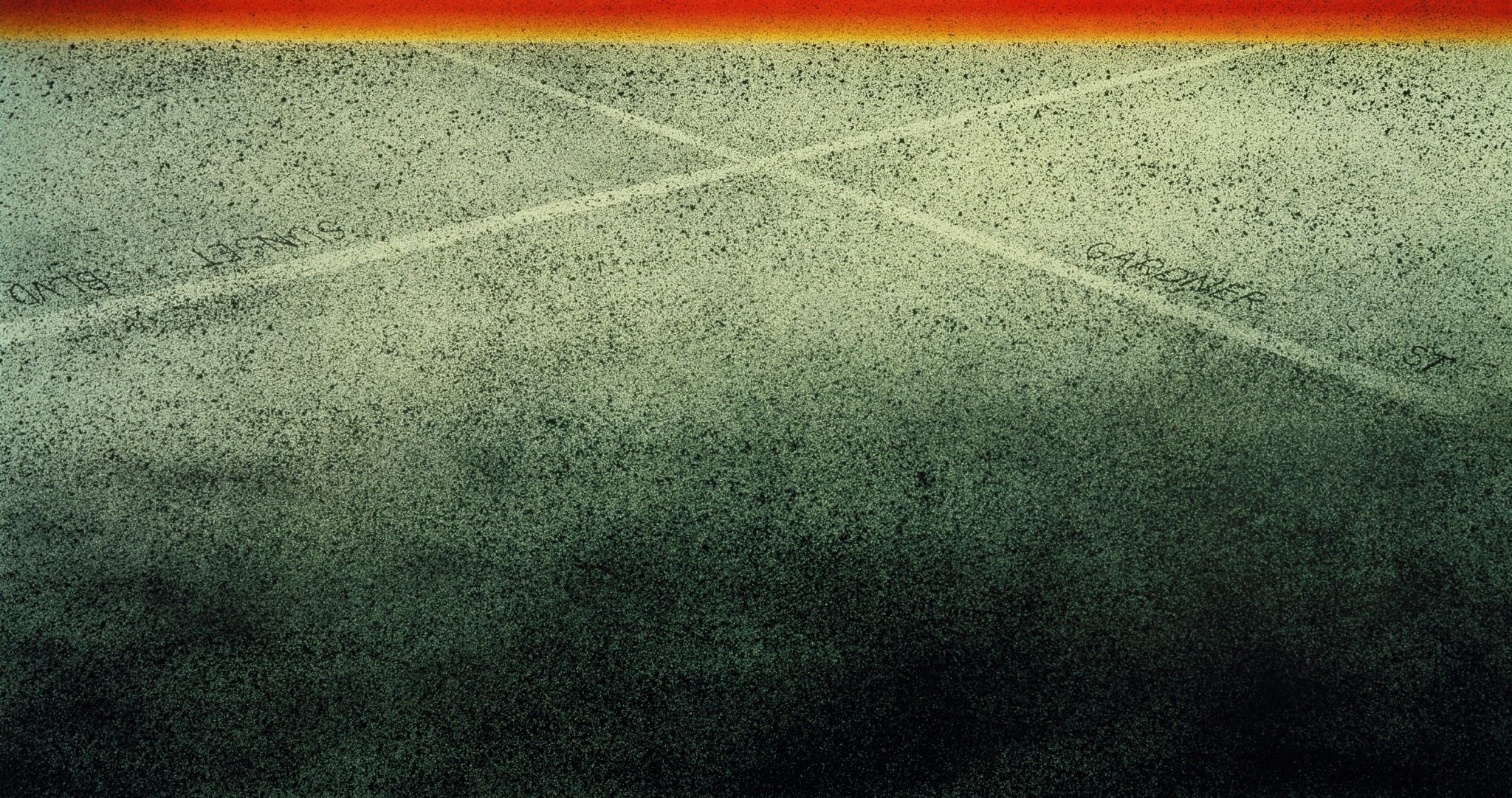
The second room of the exhibit includes pieces from Ruscha’s most deliberately urban series of paintings. Ruscha’s “city” paintings are not paintings of cities at all but rather are works of abstract expressionism that ostensibly refer to Los Angeles. Ruscha depicts the city as a grey plain of static, like an untuned television, interrupted by lines representing streets, with names that mean something only to veteran Angelenos: Oxford, Beverly, Western; Laurel Canyon/Ventura Boulevard; Sunset, Coronado. In Sunset-Gardner Cross, the entire Los Angeles Basin extends up the canvas to meet with a bonfire of yellows, oranges, and reds.

His most haunting cityscapes depict Los Angeles from above at night, with beads of light forming straight lines and right angles on the “Plains of Id,” as Reyner Banham called the working-class flats of the Los Angeles basin. His most nonsensical: the words La Brea, Sunset, Orange and De Longpre arrayed in their proper geographic arrangement against the backdrop of what appears to be Mount Everest.
Ruscha reduces the city to cartographic signifiers: lines and names. This is the bureaucratic vision, familiar to thoughtful planners, that has sapped so many American cities of their would-be texture, soul, and joy. Those implacable white dots on the prairie connote our cities in their entirety – they signify locations, but they are not places. Ruscha offers a chance for planners to step away from the trappings of bureaucracy and literally envision cities and landscapes in new ways.
You cannot think about cities without thinking the landscapes atop and within they sit. Too often the quality of California cities, especially their pedestrian environments, is inversely proportional with the grandeur of landscape. Los Angeles is not warm, and not always humane, because it was not designed to be warm and humane. The sterile, empty, vacuous Los Angeles that Ruscha depicts is a place of our own making. (The lone exception is San Francisco, which Ruscha has not, as far as I know, ever depicted.)
Too many planners of past generations approached western cities the way Ruscha does – but without the humor and without the harmlessness of paint and canvas. They created real places that are inhuman and hew more towards commerce and automobiles than to joy and communion. Ruscha’s lines are the placeless thoroughfares down which we drive.
Unlike the abstruse, theory-based creations of many of Ruscha's late 20th century contemporaries (particularly abstract expressionists), his images are aesthetically gorgeous, with the precision of a graphic designer, sense of proportion on par with Renaissance masters, and command of color rivaling Mark Rothko. These images deliberately belie what many of our cities are like.
Viewing the west through Ruscha’s eyes offers planners to think about the opposite of roadside America: the vibrancy of center cities so often dismissed as “crowds;” the pedestrian environments so ripe for redesign; the public spaces that we forgot to build as we expanded; and, most of all, the zoning laws, street patterns, and real estate typologies that pretend as if we can expand infinitely, all the way to that long horizon.
Ed Ruscha and the Great American West
On view until October 9, 2016
Tickets $22
De Young Museum
San Francisco
244 pages
FAMSF Publication / University of California Press
$55 Hardcover
All images courtesy of Fine Arts Museums of San Francisco.


