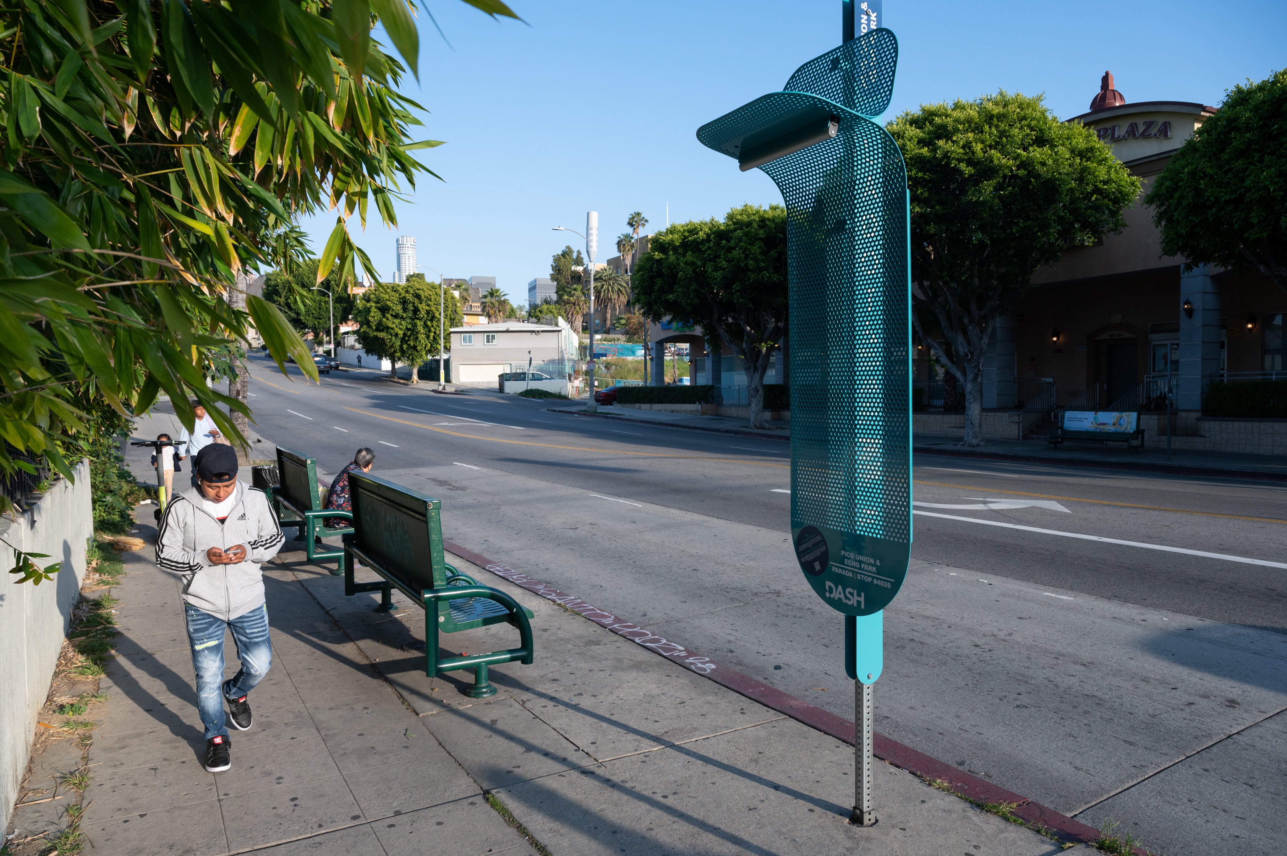
If you're waiting for a bus and you observe a sky-blue perforated protrusion that looks like an oversized fly swatter attached to a pole, you're unlikely to be overwhelmed with aesthetic rapture. But, you probably won't think much of it either.
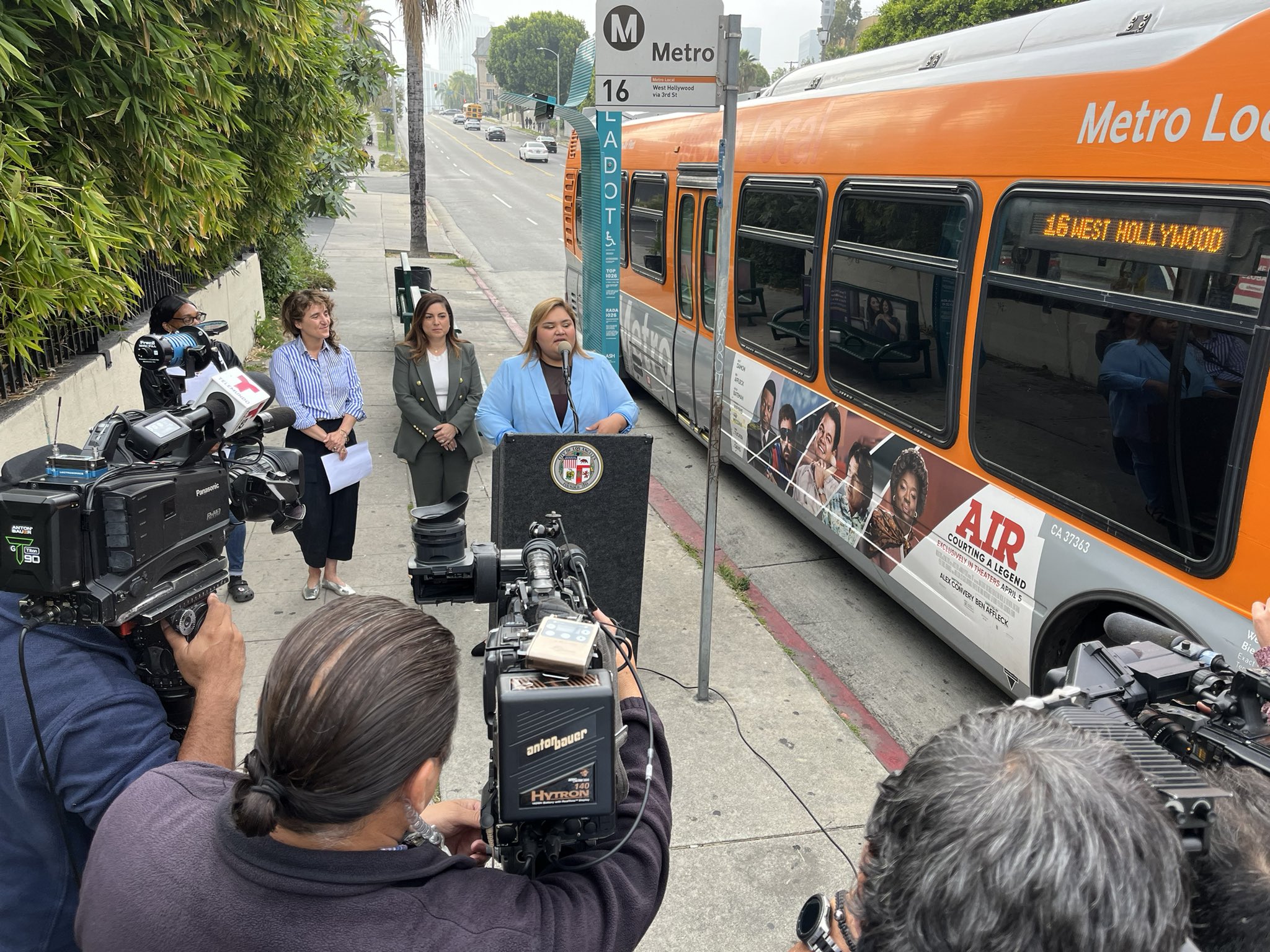
If that same fly swatter is the result of a six-figure design effort, a range of academic studies, global fact-finding trips, and--not least--a sidewalk press conference at which you are instructed to gaze upon said protrusion with reverence, you might feel differently.
The protrusion in question is the latest attempt by the Los Angeles Department of Transportation to make the pedestrian realm attractive, in a city where, lamentably, walking is still a second-class activity and transit ridership disproportionately consists of low-income, non-white, and female riders. It is a miniature bus shelter for the city's Dash circulator buses (not to be confused with LA Metro's regional public transit system), designed to provide transit information, cast light at night, and throw shade during the day.
Cringingly named "La Sombrita" (rough translation: “little hat”), the shelter was inspired in part by studies of women's experiences with public transportation in Los Angeles, conducted by researchers at UCLA, and designed by Los Angeles-based design and architecture firm Kounkuey Design Initiative in collaboration with "countless community partners and members." It's part of a larger "Gender Equity Action Plan." As you can imagine, the results of the research were not heartening. Women often feel unsafe, especially at night. (I'm sure many men and nonbinary poeple do too.) And, Los Angeles famously lacks street trees -- especially in lower-income neighborhoods.
I'm not sure we need a university study to recognize that transit riders appreciate shade in the daytime and light in the nighttime. Be that as it may, we could all use a little light and shade. On that count, La Sombrita emphasizes the -ita.
La Sombrita casts just enough (perforated) shadow to protect exactly one person -- and that's if the sun and the person are in perfect alignment. Transit information is printed on the pole too, though it’s reportedly too high for someone in a wheelchair to comfortably read. Its solar-powered light points at odd angles after dark.

For such a workaday piece of street furniture, La Sombrita promises some lofty goals:
- Improve comfort, safety, and the travel experience for women
- Deliver a quick installation project
- Cost a fraction of a bus shelter
- Can be affixed to existing bus signs with no new permits required
- Responds to community needs and moves the needle on shade and light at bus stops today while we simultaneously work on more systemic solutions.
- Usher in many other "design and policy solutions that will help make transportation more equitable for all Angelenos"
The problem here is not La Sombrita's goals, which are reasonable, or even its design, which is underwhelming but inoffensive. The problem is the press conference itself.
Were it deployed quietly, La Sombrita would probably elicit responses ranging from shrugs, to mild appreciation, to quiet snark by design enthusiasts. A few test cases could have been installed, and designers could have elicited feedback and updated future editions accordingly.
Unfortunately for LA DOT and Kounkuey, reactions on Twitter the day of its unveiling were instant--and they threw far more shade than that bus shelter ever will.
Some choice critiques, quoted from Twitter posts and replies:
- The only equity this design promotes is evenly distributed heatstroke.
- This is the kind of thing that makes public advocacy for better walkability, transit, etc., just… that much harder.
- Did y'all forget trees are a thing?
- I am begging America to do one thing transit-related like a normal country
- Did it really take "countless" contributions to make it possible this lamp-post with a tiny shader attached?
- It’s f--king terrible you should be ashamed
To really sum it up:
- An expensive sub-optimal solution only needed due to existing regulatory codes conflicting with a city’s own goals, done by consultants, disguised as “equity” and ending with a ribbon-cutting media event
(Mind you, these comments are from people who generally support public transit.)
La Sombrita sheds light on a host of problems related to design in the public realm. First, it proves that collaboration does not necessarily lead to admirable design. Second, and more poignantly, its publicity set impossibly high expectations and invited exactly the sort of scrutiny that an unassuming piece of street furniture does not warrant.
Every designer, and every marketer, should know the story of the Segway. As journalist Dan Kois impressively reported in a 2021 story in Slate, the Segway did not become a punchline because of lousy design or technology. To the contrary, it worked largely as advertised. Its failure derived from hype. Inventor Dean Kaman and his PR team promised world-changing, revolutionary, mind-blowing, toe-curling technology that would put all previous technologies to shame.
With predictions like that, the best the Segway could have done was to meet expectations.
Even worse, the publicity negated organic discovery, and the word-of-mouth reputation that would have followed. No one had the chance to "discover" the Segway; it was overexposed from the start, instantly as uncool as a pair of Dockers.
Kounkuey defended itself, tweeting, "Typical bus shelters often cost $50k or more and require coordination among 8 departments. La Sombrita (in its most expensive, prototype form) costs approximately 15% of the price of a typical bus shelter and can be installed in 30 minutes or less."
Fair enough. But Kounkuey's big mistake was that it didn't protest the insanity of needing eight city departments to sign off on a piece of street furniture. It doesn’t matter how imaginative their designers are. If they're not just as creative about reforming the regulatory scheme, then all the renderings, prototypes, and workarounds in the world don't matter.
As for the design itself, it has its logic.
La Sombrita is small because it's designed to slide over existing street-sign poles, so the city doesn't have to dig holes, pour foundations, or pull new permits. It can fit on sidewalks that aren't big enough to accommodate larger benches or shelters. It's recognizable enough, and the light is surely better than nothing. It improves Los Angeles's (often hideous) streetscape, if only marginally.

Had LADOT quietly deployed Las Sombritas in strategic locations and let transit users discover them on their own terms, I can't see anyone complaining about them (much). Instead, the department succumbed to the pressures of social media.
Plenty of pieces of design aren't Instagram-worthy. That doesn't mean they're not functional. For all the research the design team did, they forgot one thing: the weary, overheated bus rider waiting on a blazing summer afternoon in Watts probably doesn't care how many "likes" her bus shelter has.
The problems La Sombrita attempts to solve are only going to get more dire, in Los Angeles and elsewhere. Its proximate goals (shade, light, information, branding) remain worthy, and the broader values it purports to represent (social equity, gender equity, sustainability, safety) are crucial. Global warming, caused by climate change, and heat islands, caused by asphalt and thinning urban forests, will only make them more crucial. The world's cities will need more, albeit better, Sombritas.
That's why this flap is worthwhile and why the publicity serves a roundabout purpose. Cities and public agencies need to know that people are watching -- and willing to call them out. The next team of designers to come along will know that they can't get away with mediocrity and can’t gaslight stakeholders into thinking a flimsy, if well-meaning, intervention is going to save the planet. That's social media at its best.
Among all of our near-apocalyptic problems, let's just hope we don't have to find out how useful La Sombrita against a plague of locusts.
Images courtesy of the L.A. Department of Transportation, via Twitter (here and here).


